The other night, I finally got myself together to hunt through the grimmeries and other web pages of lore to find the right set of incantations that would allow me to produce a graphic more like what I’ve always wanted for the Postseason Odds Reports;. The new versions look something like this
Urg. Go here to see what it is like when it isn’t squished by the frames.
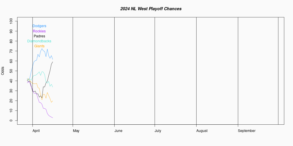
So what’s different from the old ones? A clear label for the various months (the vertical bars are the first of each month) is a really big deal, to me. The size is fixed, and shows you where the end of the season is; the old version always ended with “today”, and gave no indication of how much time was left. The flat-lining teams aren’t lost in the borders of the frame anymore, although that’s no big deal to me – still, one person I showed an early version to liked it better that way.
This improvement comes pretty late in the season, though, well after the excitement has gone out of reading these charts. Three of six division have a team who’ve reach ed a 99% chance of making the playoffs; two more are in the 88-89% range; the wild cards are also right around 99%. The one I’m showing here is the only race that, by my standard method, still has a strong pulse.
For those new to the site, the postseason projections are the result of a simulation I run every day, where I play out the rest of the season a million times. The team’s current record is known, and is always the starting point for the study. There are three different schemes that I use for rating the quality of teams, which is used to set the likelihood of winning each game, methods which have different strengths and weaknesses. All of the graphs are available by clicking on the tagged division name on each page.
The standard version uses the statistics of the team during the season. At the start of the year in this scheme, every team within a division has an equal chance of making the playoffs, chances which are only changed by the actual performance of the team. The most important factor is the team’s actual record. We also consider what a team’s record should be based on the runs they have actually scored and allowed, and also what the record would be with the expected number of runs and runs allowed, based on their batting and pitching statistics. The quality of opposition – opponent’s hitting and pitching – also figures in. I also incorporate some terms to regress the team towards the mean, and a random variable meant to simulate the fact that my rating the Red Sox as a “.585” team is just an estimate; they may really be a .650 team or a .500 team. The advantages of this method are that it makes the fewest assumptions about a team, doesn’t pre-judge, and can be readily applied to past seasons. The main disadvantage is that it does not adapt to changes in team personnel (such as injuries or trades); a team who holds a fire sale can be completely different from the team who accumulated the statistics used to rate the current version.
The second version, the “forecast” version, uses the forecast statistics of all of the players on the team to estimate the team’s quality. Unlike the standard version, this one can react immediately to changes in personnel. The biggest downside is that it takes an awful lot of work and time to maintain a full set of forecasts and depth charts and keep both of them current throughout then season. I managed to do it last year; I haven’t come close this year. You are also not going to be to do any better than your chosen forecast method, and you are going to introduce human bias with the playing time estimates. I would also add that it is nearly impossible to make an honest depth chart for a prior season, so running it for a different year is futile.
A third version was mostly dreamt up by Nate Silver,, who worked out a scheme for using Elo ratings; for baseball. Leaving aside the conversion of winning percentage to an Elo score, this version is similar to what you would get if you ran the standard version as some kind of weighted average, treating recent results (wins, runs, etc) as more valuable than more distantly past results. It even uses prior season data to start the teams with unequal chances, and it does do a better job than the standard version of reacting to changes in the team.
Generally speaking, I do prefer the original version, despite its flaws.
Oh, and yes, earthquake yesterday. Had I been elsewhere, I might have considered it exciting. Being on the fifth floor of an eight-story building, with who knows what standards of earthquake resistance – that leaves plenty of room to fall and still have a lot left over fall on top of you. I headed for the stairs with my phone in my hand, but my glasses on the desk; I realized I didn’t have them about halfway to the stairs, but since that was probably during the peak of the shaking I wasn’t inclined to turn around (especially since there were more people behind me moving forward). It was funny that I could get internet service but not phone service, and from the parking lot I pulled up the USGS earthquake site. I could not believe we had a sixish quake around here. Everything turned out fine, though, and the house didn’t have anything worse than my wife’s earring/jewelry box toppling over. Even the cats didn’t seem too upset.